Joanna Sara Adams
Graphic Design Branding Suite (2024)
Portfolio Leave-Behind Piece
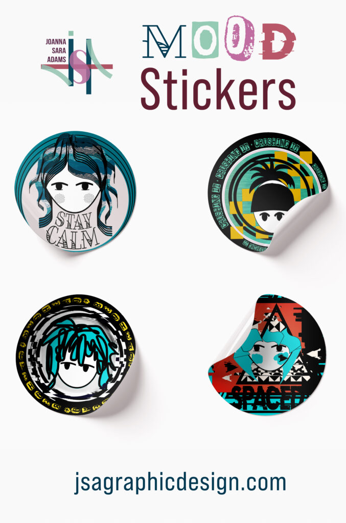
Custom mood stickers that were a personal project, based on developing characters that portray different emotions. Stay Calm, Crushing It, Bed Head, and Spaced are visual reflections using color, typography and layout to convey a mood.

Pasta Amore
The Pasta Amore Italian Restaurant wanted a fun, fresh, family atmosphere for their brand. Having identified Olive Garden and Fazoli’s as comparable competition, I strove to highlight their modern edge while not being overly pretentious for the intended family audience. The fun background accent of the food icons provides the restaurant options to utilize in products, decor and clothing. The colors palette is meant to be strong, identifiable, and timeless. The imagery features tones of black, reds and greens to create harmony with the other design elements. The typography is consistent throughout the design pieces. The logo is dominant in all pieces to ensure strong brand recognition and identity. The QR code is incorporated in all pieces to provide the restaurant with more options in menu items, specials, coupons and events. (2024)


Upper Crust Bakery
Logo and Stationary (2022)
The Upper Crust Bakery is a company seeking an updated logo, with an image that still reflects their French heritage. Their goal is to modernize and bring in a new generation of clientele while maintaining an upscale style. The typography, character, and color palette were carefully selected to meet the client’s needs and exceed their expectations on opportunities for growth with their rebranding.
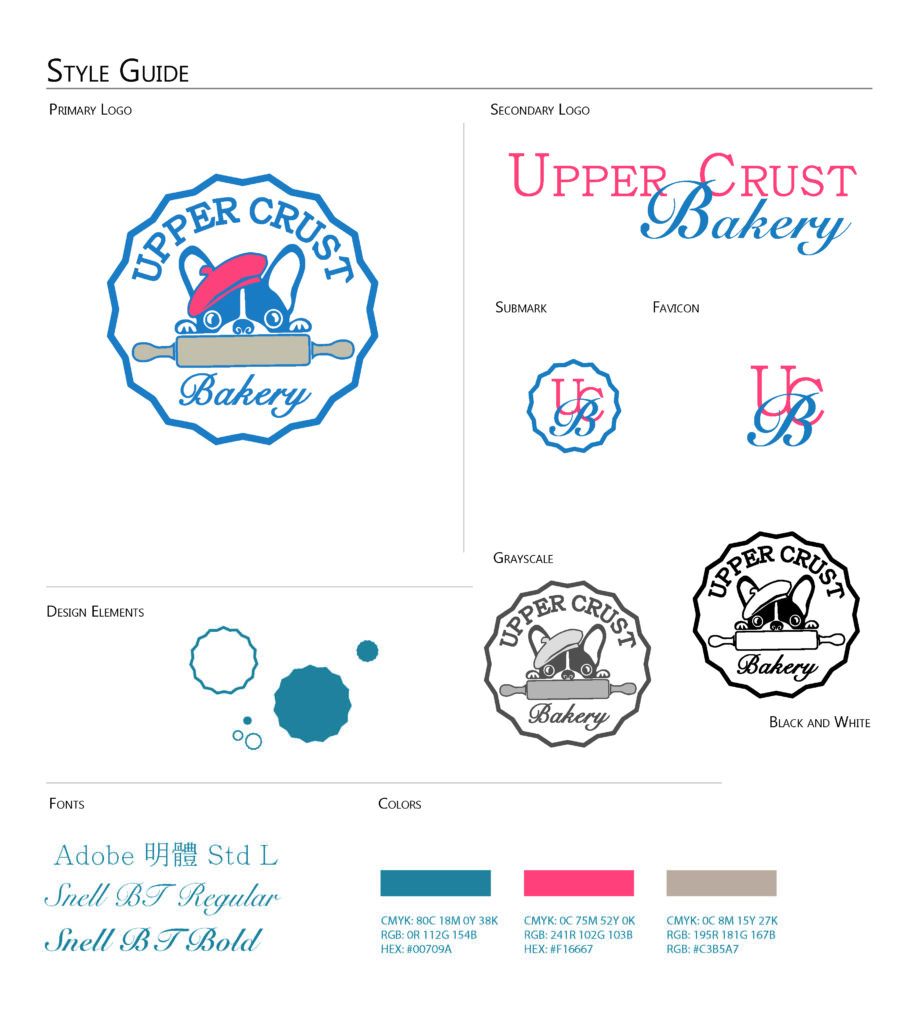

The color palette is a nod to the red, white, and blue of the French flag. The palette was softened to also provide a modern twist. The French bulldog with barrette is intended to create a playful, recognizable character for the company that would also make for pleasing merchandising. The rolling pin suggests a bakery, but also leaves room for the company to expand to broader products aside from baked goods. The zig-zag outer edge is meant to suggest a pie crust edge.
Non-Profit Branding


Louisville Recovery Community Connection (LRCC) is a local non-profit organization that serves the community experiencing substance abuse. As a new facility and program in 2019, I had the privilege to help them identify their branding and public image. Above are custom business cards and the front and back of a marketing handout designed specially for the local Pride Parade & Festival in Louisville, Kentucky in 2020.
Location
Jeffersonville, IN 47130
United States
Pages
Social
Proudly powered by WordPress