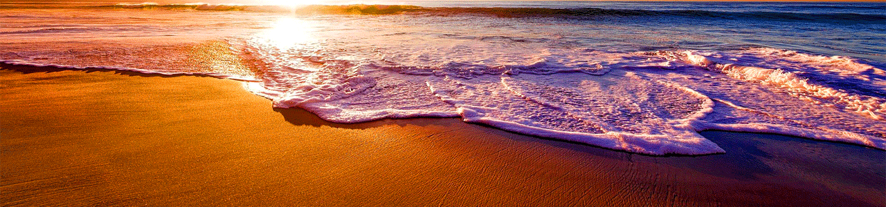

Amethyst Bay Resort & Spa
The prompt for this assignment was creating an advertising campaign for Amethyst Bay Resort and Spa featuring a magazine and online banner consistent with their existing brand. Utilizing Adobe Photoshop, the images were refined and recolored to enhance the purple hues in each photo. Advanced techniques were used to create the writing in the sand of the beach image and the overall images were intended to capture the audiences emotions as an advertising method. The final layout was performed in Adobe Illustrator with alterations to the layout to focus on the graphics as the feature of this piece. (2023)
Cover Swap
The prompt: Design two magazine cover pages, using the same image, each targeting different demographics. Using photo-editing, typography, and layout in Adobe InDesign, demonstrate how images can portray different messages in pop culture magazines. (2024)
Street Signs (above)
The above cover features styling mirroring magazines like Billboard, with strong contrast, vibrant tones, and edgy rock-and-roll characters. Magazines of this type have a stronger male demographic, though in the same age range of 25-34. The typography is bold and focuses on the business side of the music industry.
Appeal (below)
Similar to magazines like Allure, the cover page below is targeting women from ages 25-34 who take an interest in beauty, fashion, and feminine empowerment. The photo has been edited to be soft, focusing on the smooth, youthful skin of the central figure. The lettering is also light, delicate and feminine in style, framing the face and accenting key words to draw the eye.

Original Image Photographer: Alexander C. Kafka via Flickr (circa 2023), Bet You Can’t Make Me Laugh
Website: https://www.flickr.com/photos/alexanderkafka/53157655696/in/gallery-201888783@N06-72157723374661220/
Feature Article
Magazine layout featuring customized typography and photo-editing.
Adobe Photoshop and InDesign. (2022)

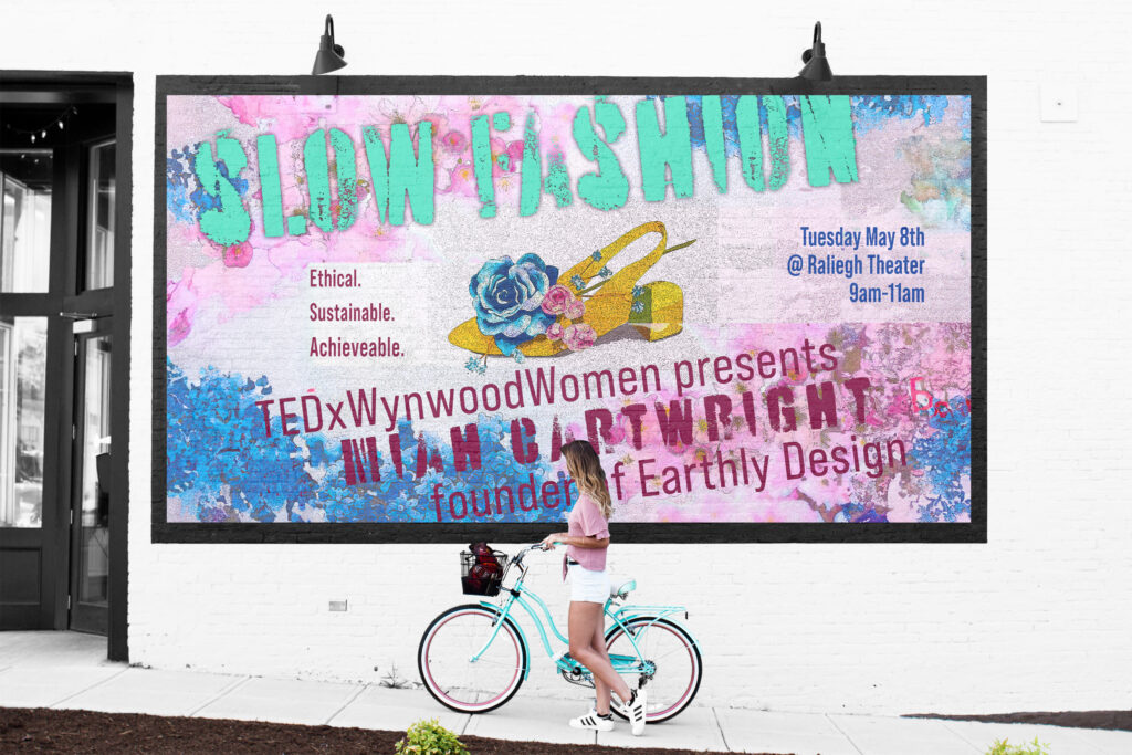
Mixed Media Advertising
This piece, of the shoe and flower in the center, was my first experience of formally using watercolor pencils. While I was unhappy with the finished product, I decided to use this opportunity to use both Photoshop and Illustrator to improve the lighting, background and shadow that was lacking in the handmade piece. I utilized photo filters to create a stylized image. The final product is a fictionalized advertisement for a TEDx speaker. The grungy, rough appearance is a throw back to my Swash and Stem Studio Design project, as well as a nod to the 90s era that inspired it. (2024)

Digital Newsletter
Non-profit organization’s monthly newsletter, developed through Adobe Photoshop and Windows Publisher. Delivered through MailChimp and social media platforms. Created layout, photo-editing and topical article writing. (2019)
Location
Jeffersonville, IN 47130
United States
Pages
Social
Proudly powered by WordPress