Inspiration
This calendar is designed in the style of David Carson, focusing on the distortion of 1990s typography and layering. There was a rebellious quality to the design of that era that reflected Gen X moving away from mass-produced media in the booming age of technology. Carson’s designs featured a mixing of typefaces, with typography going in often several different directions and layers of colors and images overlapping. It has the feel of collage or mixed media art, with esthetic prioritized over clarity. Created in Adobe Illustrator and InDesign. (2024)
Business Design
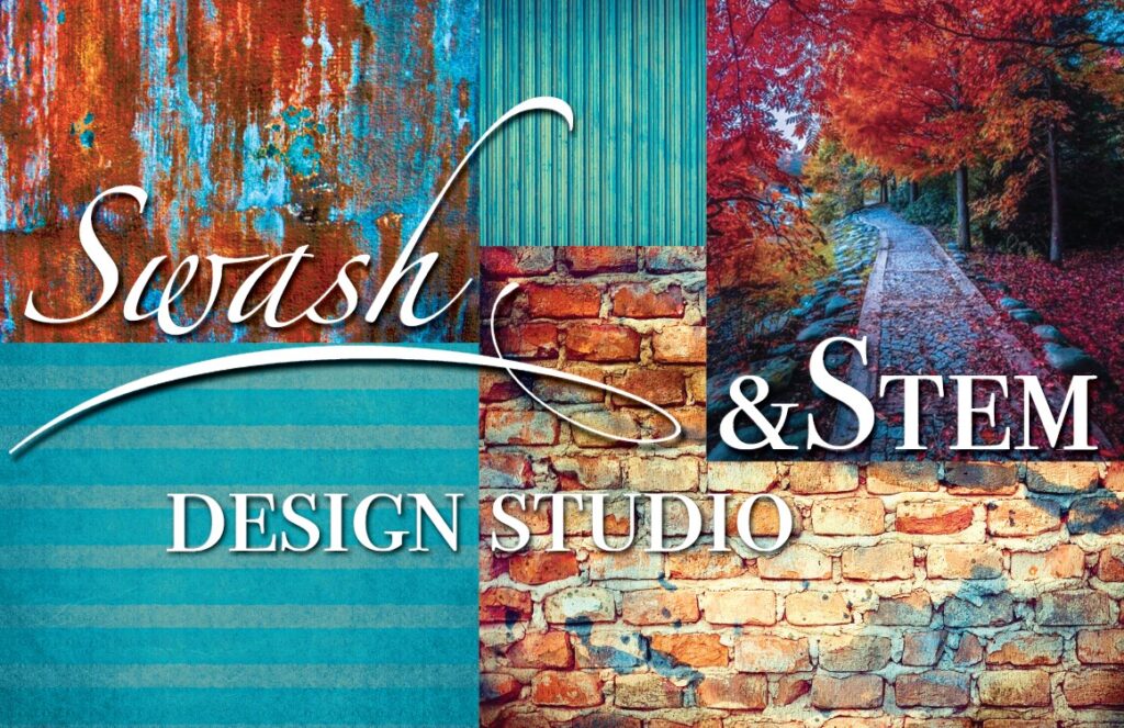
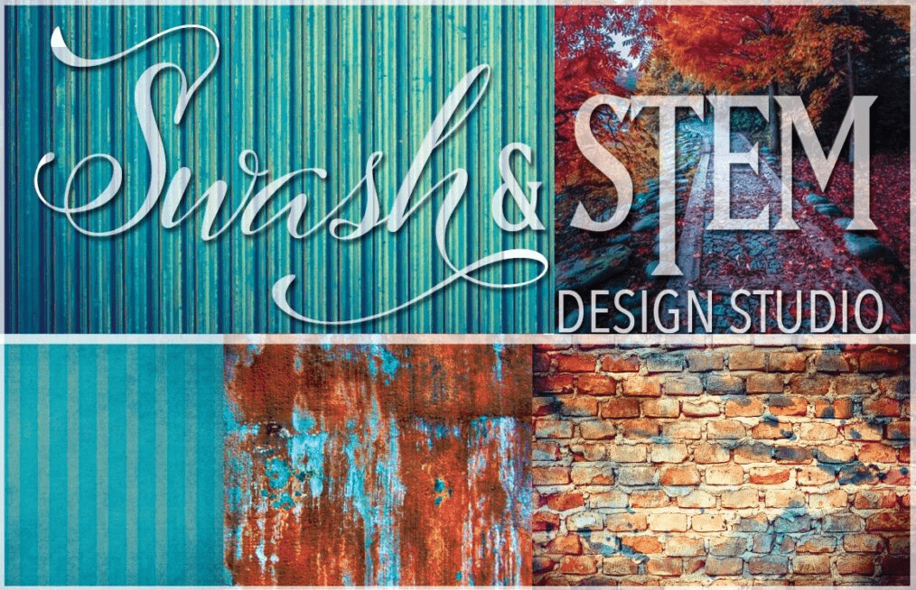
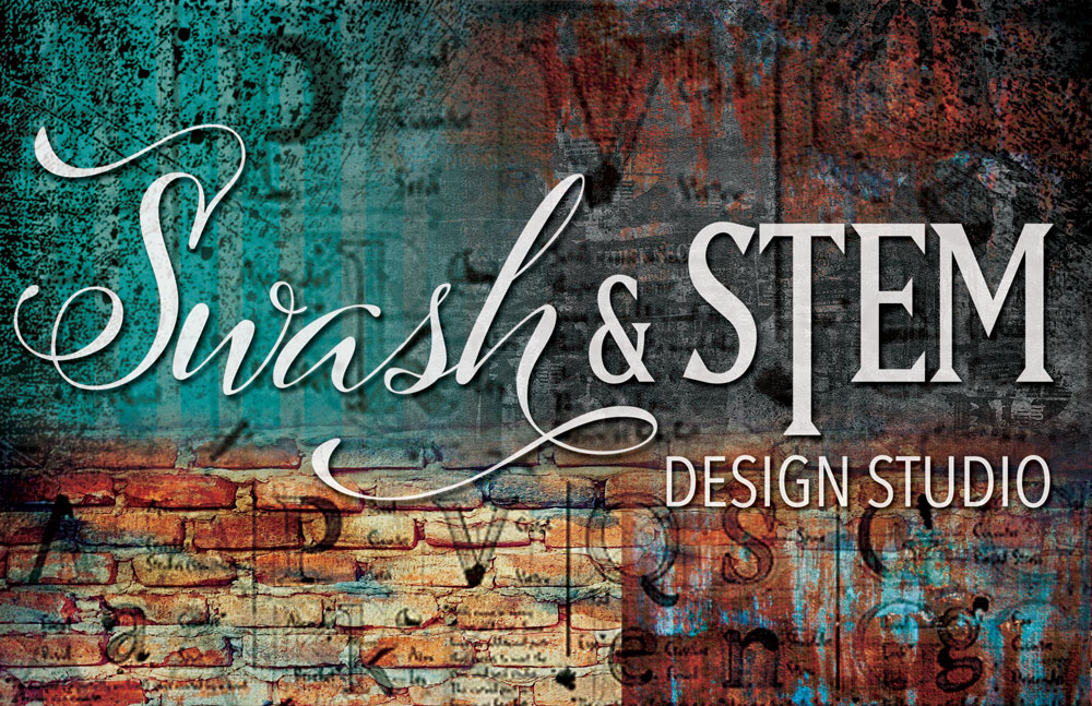
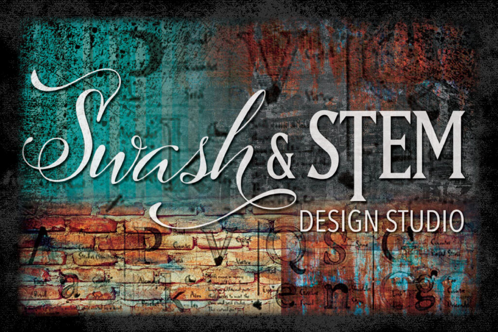
This project was to create a business name for ourselves as a graphic designer. This collage required imagery that would display the business style and typography that represented the brand. My selected name utilizes typography terminology that indicates my passion for typography and typeface manipulation. The voice for my brand is meant to be whimsical, dreamy, with a darker edge. I enjoy bold colors, strong contrast, clean lines and purposeful asymmetry. The texture of brick, rust and ink gives a gritty, vintage feel. All editing done in Adobe Photoshop. (2022)
Typography Portrait
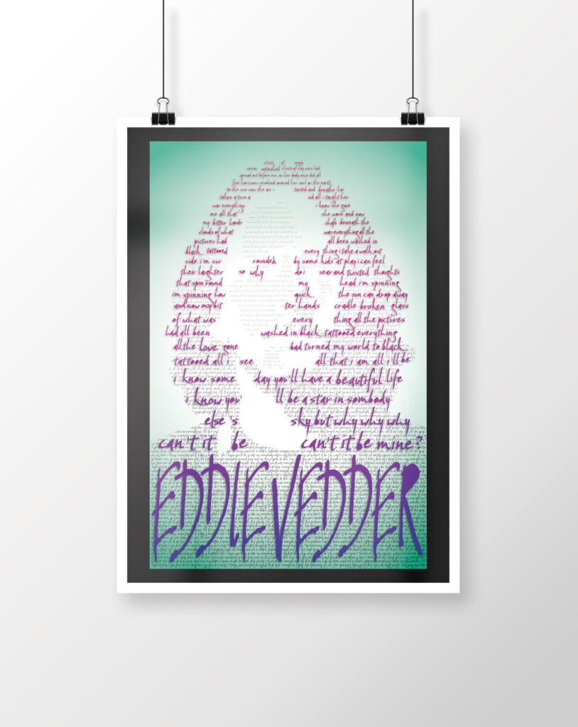
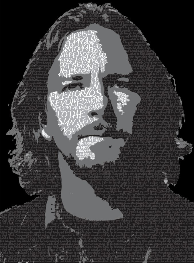
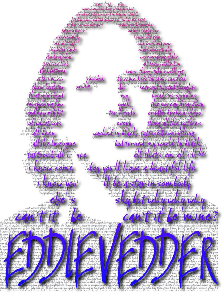
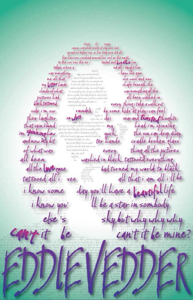
The prompt for this project was to select a celebrity who is meaningful to us and use appropriate words and typeface to capture their image. The font utilized for this typographic portrait is Baka Too, created by type designer Neil Summerour. The font has a handwritten style with the natural quirks and variations that come with the human touch. This represents the songwriter aspect of Eddie Vedder, who explores difficult, sometimes vulnerable themes in his lyrics. The somewhat messiness of the typeface is also a nod to the 90s era in general, which favored deconstructed designs that were not always focused on the clarity of the font itself. All editing was performed in Adobe Photoshop and Adobe Illustrator. (2023)


Magazine Spread
This project was to develop a magazine spread based on the article content. The story is a parable that encouraged me to use a typeface that mimics something used in a children’s book. The unique layout was created in Adobe InDesign. The lute details in the “U” were created in Adobe Photoshop. (2023)
Proudly powered by WordPress
